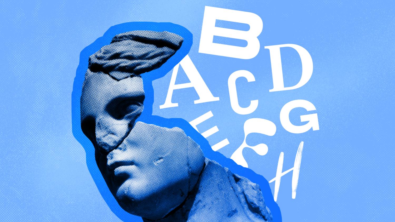
If you want to create designs that connect, here's how to use the psychology of fonts to evoke emotion through your work.


Designers have used powerful fonts to give designs a certain mood and feel for decades, but the power of font psychology to shape individuals’ emotional responses to a brand or logo has only been fully realized in recent years. Fonts that provoke a psychological reaction can be used to make a brand feel more trustworthy, friendly, or aspirational, with designers often turning to emotional fonts to give brand identities a powerful psychological impact.
Here, discover how to apply the psychology of fonts in logos, as well as in branding and design more broadly, using psychologically powerful fonts to shape the reactions of your audience.
From advertising fonts able to convince customers to part with their cash to unique and different fonts that help to give brands a stand-apart identity, this is your ultimate guide to understanding and applying the psychology of fonts.
What is the Psychology of Fonts?
Images are not simply colors and shapes on a page, or at least not for humans.
Human beings have an innate instinct to anthropomorphize non-human entities, applying human characteristics and emotions to things that are distinctly non-human – such as logos, for example.
Because human beings respond to visual culture in an emotional way, designers can manipulate the psychological responses of their viewers by making informed choices about the features of a design, such as colors and fonts. Applying the psychology of fonts in marketing is starting to become an important field of research and practice in branding and advertising.
Although this was once the preserve of large corporations, now smaller businesses are also recognising the value of applying the psychology of fonts in marketing and brand design. Different fonts have been proven to have astonishing effects on human psychology, with some powerful fonts even able to alter the taste of food or make people angry to the point of social revolution. It’s no surprise, then, that brands are starting to hire designers with a savvy knack for understanding the psychology of fonts and finding a use for emotional fonts.
For designers and businesses, an understanding of typography psychology is key to shaping both how memorable a brand is and how customers perceive it.
Because human beings are more engaged with visual content than written content (a phenomenon termed the Picture Superiority Effect by psychologists), the appearance of the text (i.e. the font) on a brand’s logo, advertising, and other output is more important in determining brand perception and brand memorability than the written content.
Not only is the appearance of text an important consideration for brands, but the appearance of different fonts can also have psychological effects on the viewer. By changing the style of font, choosing a more emotional font or a powerful font, a designer can make the viewer feel and respond differently towards a brand.
For example, a bank that wants to communicate a sense of stability and heritage to its customers might opt for a traditional serif font, while a tech start-up might choose a futuristic sans serif font, to encourage customers to perceive them as innovative and forward-thinking.
A psychological approach can also be taken toward other design elements, such as color. Savvy designers can combine multiple psychological effects by choosing particular fonts and colors, resulting in a psychologically engineered combination of design elements that communicates one or multiple emotional moods.
Although the psychology of fonts is most keenly applied in the world of branding, designers working with any form of text should know a little about how font choice affects the mood and perception of viewers.
Typesetting a book? A transitional serif font like Baskerville will help readers feel that the text has more authority and intellect.
Designing a wedding invitation? The right script font can simultaneously communicate romance, fun, and tradition.
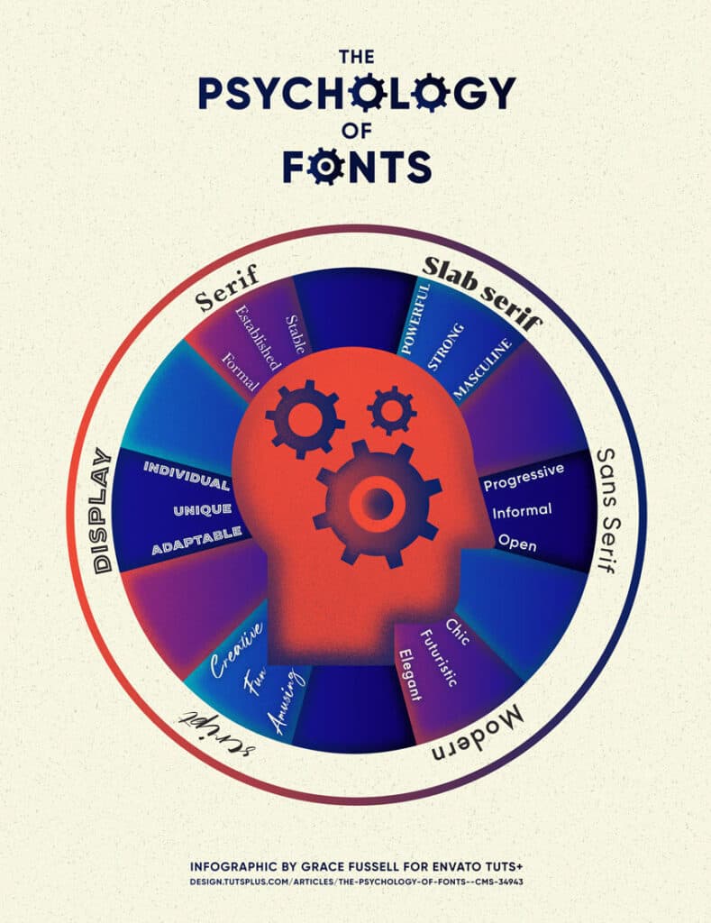
Below, discover the six major different font groups, their psychological associations, and examples of how the psychology of fonts is used in brand design.
1. Serifs: Trustworthy Fonts
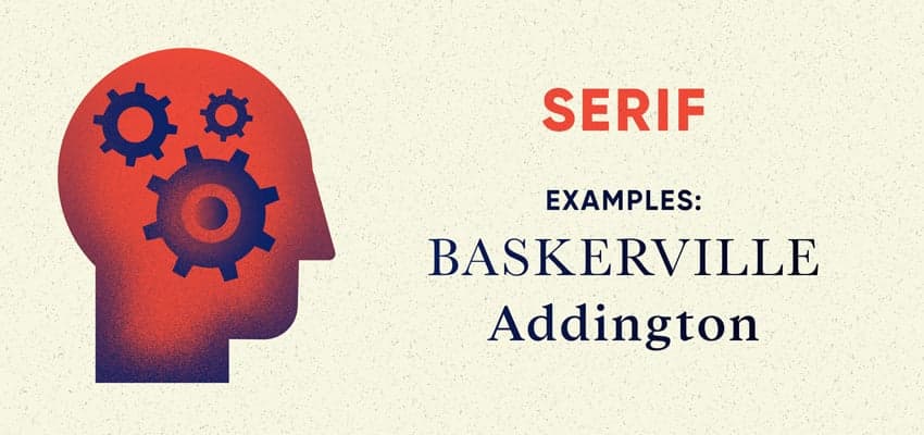
Psychological Associations of Serif Fonts: Stability, Tradition, Intellect, and Formality
Let’s talk about the formal fonts: the serif typefaces. Until the 19th century, books and pamphlets were set in serif type – a style inherited from early Roman and, later, Blackletter typefaces. The first sans serif typeface appeared in print in 1816, but serifs still remained widely popular throughout the late 19th century and into the early 20th century.
Because of this heritage, these formal fonts instantly evoke a sense of establishment and tradition, an association that is carried through into the branding and marketing of law firms, banks, and newspapers. It’s a favorite font style in publishing, with most books still set in serif type, helping to communicate a mood of intellect and authority to readers.
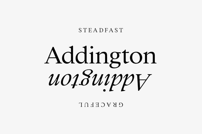
The psychology of fonts in a serif style stems from their history. Because we are used to seeing serif fonts as symbols of heritage (on historical artifacts and prints), intellect (in books and academic papers), and formality (on fancy invitations and high-end restaurant menus), we perceive serif fonts as trustworthy and dependable. In other words, we know where they’ve been and that they are often the defining, powerful font style of long-established and respected institutions, such as universities and banks.
Aside from colleges and financial institutions, many of which have been using serif typefaces for decades or centuries, other businesses looking to appear equally trustworthy and established can use a serif font to assert this in their branding. Law firms, news channels, and luxury fashion brands often use serif fonts in their branding and communications to capitalize on the dependability association. Serifs are trustworthy fonts without a doubt.
Examples in Logo Design: HSBC, Wikipedia, TIME, CBS News, Gap, Dior, Rolex, Vogue, Tiffany & Co
Fonts to Try: Baskerville, Addington, Garamond, Caslon
2. Slab Serifs: Powerful Fonts
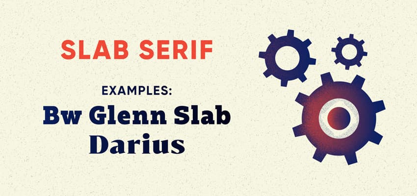
Psychological Associations of Slab Serif Fonts: Enduring, Strong, Powerful, and Masculine
Slab serif fonts are chunkier, bolder interpretations of the serif-type style. Usually thicker along both the stem and serifs of letterforms, they inherit some of the traits of serif fonts, such as stability and tradition, but are also bolder and more distinctive.
Slab serif fonts lack the delicacy of serif fonts, making them feel a little brash and macho. Electronics companies and car manufacturers often use slab serifs to communicate a sense of power and masculinity in their branding.
In the wrong context, a slab serif could feel confrontational, but when used in the branding of companies that have a manufacturing focus, they feel strong, capable, and enduring. A slab serif is an assertive and powerful font, telling viewers that this is a practical, hands-on business that also has historical, dependable roots.
Examples in Logo Design: Sony, Honda, Volvo, IBM, Coach
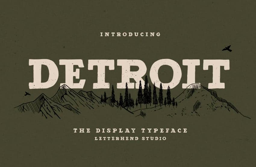
Fonts to Try: Rockwell, Detroit, Darius, BW Glenn Slab
3. Sans Serifs: Friendly Fonts
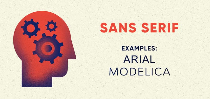
Psychological Associations of Sans Serif Fonts: Progressive, Informal, Open, and Friendly
Referring to a wide group of fonts that lack serifs (the small strokes attached to the ends of letterforms on serif fonts), sans serif typefaces were formally invented in the early 19th century but only became popular much later, during the 20th century, when the modernist movement championed a break away from traditional design forms, including serif type styles.
Sans serif fonts are progressive and emotional fonts, historically popular as advertising fonts and cool fonts for posters. These friendly fonts culturally represent a break with tradition, giving these emotional fonts a progressive personality.
In recent decades, these simple and different fonts have defined the branding of a wide number of tech companies and social media sites, helping users to feel that these products are forward-thinking – the opposite of the sometimes stuffy, change-resistant reputation of serif styles.
The psychological association with progression and modernity also extends to brands that want to appear innovative and adventurous, such as Jeep, Land Rover, and National Geographic.
Unencumbered with the fuss of decorative serifs, sans serifs appear as open and friendly fonts, making them a favorite with businesses that want to appear approachable and good value. Budget airlines, logistics companies, and high-street retailers often opt for sans-serif fonts to make their customers feel welcome and comfortable.
Examples in Logo Design: Nike, Apple, Facebook, Microsoft, Dropbox, Spotify, FedEx, National Geographic
Fonts to Try: Arial, Modelica, Open Sans
4. Modern Sans Serifs: Chic Fonts
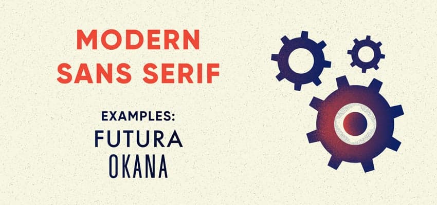
Psychological Associations of Modern Sans Serif Fonts: Chic, Futuristic, and Elegant
A sub-family of sans serif fonts, modern sans serifs are sans serif fonts in the tradition of early- to mid-20th-century modernist type styles. Helvetica, Futura, and Avenir are some of the oldest and best-known modern fonts, but the popularity of the style has endured, with a huge range of contemporary geometric sans serifs to choose from.
These chic fonts were often used as advertising fonts and associated with the boom in modernist design during the 1950s. They’re a popular choice amongst design-focused businesses and brands, such as architecture practices, furniture retailers, and fashion brands. In fashion in particular, a clear split down the line emerges between brands who opt for the lofty, luxurious elegance of serif fonts, such as Dior and Valentino, and those who prefer the chic functionality of sans serifs, including Chanel and Calvin Klein. The latter group, it seems, would rather appear more futuristic and minimalist in both brand and business.
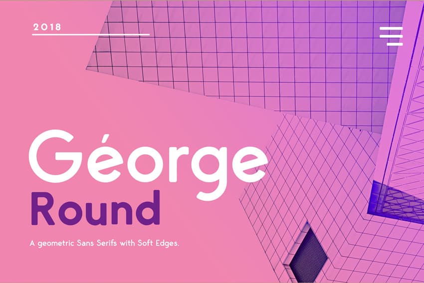
Geometric, elegant fonts often also feature rounded letterforms, giving them an open, functional appearance. These chic fonts can be exceptionally rounded, such as George Round, giving the viewer a sense of playfulness and naivety and making them a popular choice for children’s brands, as well as travel and entertainment brands targeting the older millennial market.
Examples in Logo Design: Chanel, Celine, Calvin Klein, Burberry, Netflix, Google, Airbnb
Fonts to try: Futura, George Round, Okana
5. Scripts: Fun Fonts
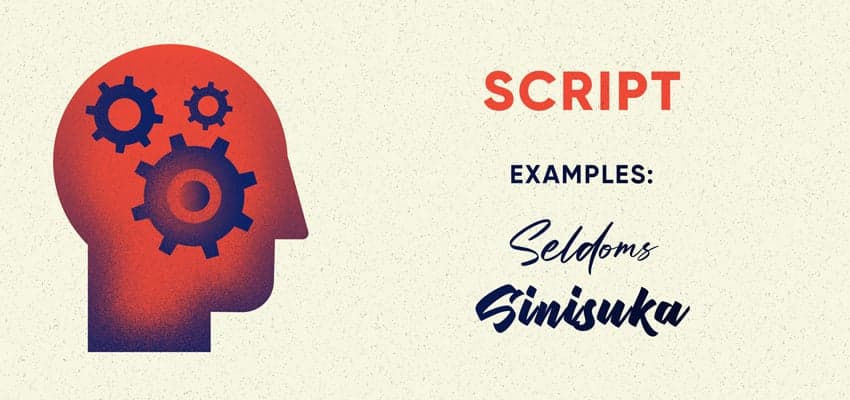
Psychological Associations of Script Fonts: Creative, Amusing, Fun, Childlike, and Romantic
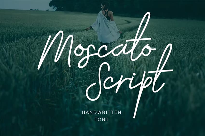
Script and fun handwriting fonts can lean towards formality or naivety, depending on the style and context. That’s the beauty of typography psychology. Calligraphy fonts, inspired by the traditional method of handwriting using ink pens, feel more formal and sophisticated and are often adopted by luxury brands or high-end restaurants in their branding and menus. Many contemporary script fonts are more informal and eclectic, mimicking the diversity of modern handwriting styles and making them fun fonts.
These eclectic and different fun fonts are evocative of handwriting and doodling, connecting them with creativity and eccentricity. Given their unique and quirky form, these emotional fonts are rarely somber. Script fonts also remind the viewer of youth and first romances, making them a popular choice for Valentine’s cards and wedding invitations.
The association with youth and amusement also makes fun handwriting fonts popular for candy packaging and food products aimed at children, such as cereal and soft drinks, as well as cool fonts for posters and advertising fonts.
In terms of the psychology of fonts in marketing, script fonts have a particular history. In some cases, these emotional fonts have a retro personality, as these types of styles (sometimes referred to as ‘diner’ fonts) enjoyed spells of popularity in advertising and branding during the 1950s. Brands like Ray-Ban and Coca-Cola have chosen to retain the original script form of their logos – reinforcing a connection between the past and present and tapping into a nostalgic marketing mood.
Examples in Logo Design: Disney, Mailchimp, Ray-Ban, Coca-Cola, Reese’s, Pinterest, Virgin, Kellogg’s, Budweiser, Cartier
Fonts to Try: Sinisuka
6. Display: Independent Fonts
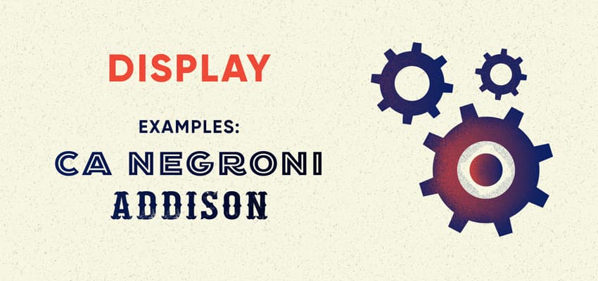
Psychological Associations of Display Fonts: Novel, Trail-Blazing, Unique, and Adaptable
If you encounter a different font you can’t quite place in a neat category, it’s likely it would be classified as a display or novelty font. Some of these types of powerful fonts create a sort of pictographic representation, blending a graphic image with text (see the Tour de France and NASA logo designs), while others are simply heavily stylized. Display fonts are largely meant for that purpose alone, meaning they can work wonderfully as part of headlines or logo designs but rarely as standard text intended for longer reading.
Designers and brands usually opt for display fonts to give an impression of individuality and difference, with the practice of the psychology of fonts for logos often featuring display styles. Many of the logo examples below use completely customized fonts or illustrative type, using the psychology of fonts in logos to create a unique effect that is unlikely to be seen anywhere else. For playful brands like Lego and Oreo, logos set in display fonts heighten the novelty of the product, making it feel more exciting and interesting.
Display fonts are not for the shy and retiring – by using one in your design, you are imploring viewers to ‘look at me!’ However, these unique fonts are definitely fonts that evoke emotion and can’t be ignored. So for brands looking to appear distinct from similar businesses, they can help to foster a sense of uniqueness and inspire fierce loyalty amongst their employees and customers, who feel they are buying from or working for somebody who does things a little differently to the mainstream.
Grassroots and independent organizations also often opt for display fonts in their communications, serving to mark them out as anti-conformist and trail-blazing.
Examples in Logo Design: Tour de France, Yahoo!, NASA, Lego, Subway, Oreo, Greenpeace, MTV, Warner Bros
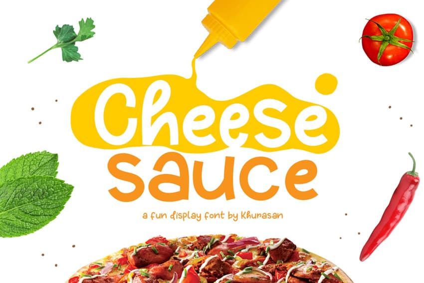
Fonts to Try: CA Negroni, Cheese Sauce
Leverage the Power of Font Psychology Today!
Knowing a little about the psychological effects that different font styles can have on the viewer can help you make more informed design decisions, especially when it comes to creating brand identities and logo designs. An understanding of these effects will allow you to apply the principles of the psychology of fonts to marketing and the psychology of fonts in logos. Using different and powerful fonts can instantly shift the personality and psychological impact of your designs, leading to more effective branding decisions.
Want to learn more about the psychology of design? Discover more about how your choice of color can affect the mood and overall success of your designs with our article on color psychology. Or, discover a range of cool, psychologically powerful, and emotionally evocative fonts on Envato Elements.